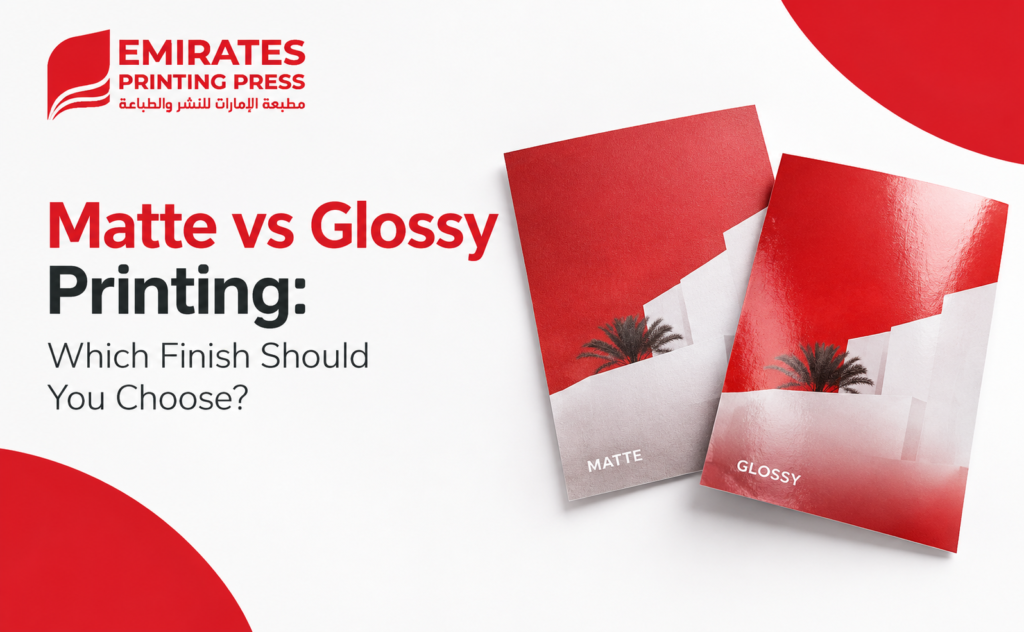
Choosing a paper finish can change how a printed design looks, feels and performs. If you are preparing business cards, brochures, flyers, menus, photographs or other marketing materials, one of the most common decisions is matte vs glossy printing.
Matte and glossy finishes are not simply two different styles. They interact with light differently, affect how colours appear, influence readability and create different impressions when someone handles the finished print.
So, which one should you choose?
The answer depends on what you are printing, where it will be viewed, how frequently it will be handled and the visual impression you want to create. Matte is generally better when you want a subdued, professional appearance with reduced reflections, while glossy is often preferred when vibrant colour, contrast and visual impact are the priority.
What Is the Difference Between Matte and Glossy Printing?
The main difference is how the surface of the printed material reflects light.
Matte printing has a low-reflection surface that gives the print a softer and more understated appearance. It is particularly useful when readability and reduced glare are important.
Glossy printing has a smooth, reflective surface that gives colours and images a more vivid appearance. It can make photographs and graphics look bold and eye-catching, although reflections can become noticeable in strong lighting.
Neither finish is automatically better. The right option depends on the purpose of the print.
Matte vs Glossy Printing: Quick Comparison
Feature | Matte Finish | Glossy Finish |
Overall appearance | Soft, refined and understated | Bright, polished and eye-catching |
Light reflection | Low | High |
Colour appearance | Natural and subdued | More vibrant and punchy |
Readability | Generally easier under reflective lighting | Can be affected by glare |
Fingerprints | Less noticeable | More noticeable |
Photography | Soft, sophisticated appearance | Strong colour and contrast |
Writing | Generally more suitable | Less convenient |
Brand impression | Professional, elegant and modern | Energetic, bold and visually strong |
Best suited to | Text, corporate materials and premium designs | Photos, promotional graphics and image-heavy materials |
The table provides a starting point, but the final decision should also consider the specific product and environment.
Choose the Right Finish for Your Prints
Get professional printing guidance and quality finishes tailored to your project in Ras Al Khaimah.
What Is Matte Printing?
Matte printing uses a non-shiny surface that reduces reflections. Instead of producing a strong shine when light hits the paper, the surface gives the printed piece a flatter and more subtle appearance.
This makes matte a popular choice when the reader needs to focus on text, when the print will be viewed under strong lighting or when the design is intended to communicate a refined visual style.
Advantages of Matte Printing
- Reduced glare
One of the biggest benefits of matte is its low-reflection surface. This can make text and other important information easier to view when lighting is coming from different directions.
- Professional appearance
Matte finishes often work well for corporate and premium designs because they create a restrained appearance rather than an intensely reflective one.
- Fewer visible fingerprints
Frequent handling can leave marks on highly reflective surfaces. Matte surfaces generally make fingerprints and minor smudges less obvious.
- Good for text-heavy designs
If a printed piece contains substantial amounts of text, a low-glare surface can improve the overall reading experience.
- Suitable for understated branding
Brands that prefer minimalist, sophisticated or elegant visual identities may find matte more appropriate than a highly reflective finish.
When Should You Choose Matte?
Consider matte when your printed material:
- Contains a lot of text.
- Will be viewed under bright or mixed lighting.
- Needs a refined and professional appearance.
- Will be handled frequently.
- Needs space for writing or handwritten notes.
- Uses a minimalist or understated design.
- Is intended to communicate a premium corporate feel.
For example, a company producing a detailed corporate brochure may prefer matte because the reader’s attention needs to remain on the information rather than surface reflections.
What Is Glossy Printing?
Glossy printing uses a smooth, reflective surface that gives printed colours and images additional visual intensity.
The smooth surface is particularly effective for image-driven designs. Photographs, product images and colourful promotional graphics can benefit from the strong visual impact of gloss.
Advantages of Glossy Printing
- Strong colour impact
Glossy surfaces can make colours appear more vivid and visually prominent.
- Excellent for photographs
Photography often benefits from the contrast and visual punch associated with glossy finishes, particularly when the objective is to make images stand out.
- Eye-catching appearance
Glossy prints can immediately attract attention because of their polished and reflective appearance.
- Smooth surface
The slick surface creates a different tactile experience from matte and can give promotional materials a highly finished appearance.
When Should You Choose Glossy?
Glossy can be a strong option when your printed material:
- Relies heavily on photography.
- Uses bright and saturated colours.
- Needs strong visual impact.
- Is designed as promotional material.
- Contains product imagery.
- Is intended to look polished and vibrant.
For example, a product catalogue featuring large, high-quality photographs may benefit from glossy printing because the images are a central part of the communication.
Make Your Print Finish Stand Out
Compare matte and glossy options with Emirates Printing Press and choose the finish that fits your design.
Matte vs Glossy: Which Is Better for Different Print Materials?
There is no universal winner. The best finish changes depending on the printed product.
Business Cards
Both finishes can work well for business cards.
Choose matte if you want a sophisticated, understated card that feels professional and is comfortable to handle.
Choose glossy if the card uses colourful graphics, photography or a highly visual design where maximum impact is important.
For simple corporate designs, matte is often the safer starting point. For bold creative designs, glossy can make the artwork stand out.
Brochures and Flyers
Think about the ratio of text to imagery.
A text-heavy brochure can benefit from matte because reduced reflections help maintain readability.
A promotional flyer dominated by photographs, colourful graphics or product imagery may benefit from glossy because the finish reinforces visual impact.
For businesses using flyers as promotional material, the choice should therefore follow the design rather than simply choosing the finish that looks more attractive on its own.
Menus
Menus require special consideration because they are handled frequently and often viewed under artificial lighting.
Matte can be useful when readability and reduced glare are priorities. It can also provide a clean, refined appearance.
Glossy may be appropriate for image-heavy menus where food photography is the main visual element, but reflections should be considered if the menu will be used under strong overhead lighting.
Photographs
For photography, glossy is often selected when the objective is strong colour, contrast and visual impact.
Matte can be preferable when the photograph will be displayed in an environment where reflections are distracting or when a softer, more restrained appearance is desired.
The viewing environment is especially important. A finish that looks excellent under one type of lighting may be less suitable under another.
Catalogues and Product Marketing
Product catalogues often contain a combination of photography, specifications and descriptive text.
If photographs dominate, glossy can create a strong visual presentation.
If the catalogue requires considerable reading, matte may provide a more comfortable experience.
For mixed-content catalogues, the decision should be based on which element—visual impact or readability—is more important.
How Lighting and Readability Affect Your Choice
Lighting is one of the most overlooked factors in the matte vs glossy printing decision.
A glossy surface can reflect overhead lights, windows or other bright sources. Depending on the viewing angle, those reflections may interfere with text or important design elements.
Matte reduces this problem by scattering reflected light more evenly.
This does not mean glossy printing is unsuitable for bright environments. It simply means that you should consider where the finished print will actually be used.
Ask yourself:
- Will people read it under strong indoor lighting?
- Will it be displayed near windows?
- Will customers hold it in their hands?
- Will the print be viewed from different angles?
- Is photography more important than long-form text?
The answers can quickly point you toward the more appropriate finish.
Ready to Print Your Next Project?
Talk to Emirates Printing Press for the right paper, finish and printing solution for your business.
Matte vs Glossy for Branding and Professional Appearance
Your choice of finish can also influence how people perceive a printed brand.
Matte often supports a visual identity that is:
- Professional
- Minimalist
- Refined
- Elegant
- Modern
- Understated
Glossy can support a visual identity that feels:
- Bold
- Energetic
- Colourful
- Promotional
- High-impact
- Image-focused
This does not mean every premium brand should use matte or every retail brand should use gloss. Your design, paper stock, colours, typography and finishing choices all work together.
The finish should support the brand rather than compete with it.
Common Mistakes When Choosing a Print Finish
Choosing Based Only on Appearance
A finish may look impressive when viewed as a sample but perform differently in the environment where the final material will be used.
Always consider lighting, handling and readability.
Using Glossy for Text-Heavy Materials Without Considering Glare
Glossy can look excellent, but reflections may interfere with smaller text under certain lighting conditions.
Assuming Matte Means Dull
Matte does not mean poor-quality printing. It simply produces a different visual effect. High-quality designs can look sophisticated and polished without a strong shine.
Ignoring the Design
A photograph-heavy design and a text-heavy design have different requirements. The finish should complement the content.
Choosing the Finish Before Understanding the Project
The paper finish should be one part of the broader printing decision. Paper weight, stock, colour requirements, dimensions, coating and intended use can all affect the final result.
How to Choose the Right Finish for Your Project
If you are still unsure, use this simple decision process.
Choose matte when:
- Readability is a priority.
- The design contains substantial text.
- You want minimal reflections.
- The material will be handled frequently.
- You prefer a sophisticated and understated appearance.
- The print will be used in varied lighting conditions.
Choose glossy when:
- Photography is central to the design.
- Strong colour impact is important.
- You want a shiny, polished appearance.
- The material is primarily visual or promotional.
- You want images and graphics to stand out.
If both options seem suitable, request physical samples before committing to a large print run. Seeing the same design on different finishes can make the difference much easier to judge.
For businesses comparing professional printing services in Ras Al Khaimah, discussing the intended application with the printer can also help identify the most appropriate combination of paper, finish and printing method.
Matte vs Glossy Printing: Which Finish Should You Choose?
There is no single answer to the question of whether matte or glossy printing is better.
Choose matte when you prioritise readability, low glare, frequent handling and a refined appearance. Choose glossy when vibrant colour, strong contrast, photography and visual impact are more important.
The best finish is ultimately the one that matches the purpose of your printed material.
Whether you are preparing business cards, brochures, flyers, menus, catalogues or other commercial materials, consider the content, viewing environment, handling requirements and brand style before making your choice. Learn more about Emirates Printing Press and its approach to professional commercial printing.
If you are planning a print project in Ras Al Khaimah, explore the printing services available from Emirates Printing Press. Visit the Emirates Printing Press homepage to learn more, or contact the printing team to discuss your project, paper finish and printing requirements.
Matte or Glossy? We Can Help
Get expert guidance on choosing the right finish for business cards, brochures, flyers, menus and more.
Frequently Asked Questions
Is matte or glossy better for printing?
Neither is universally better. Matte is generally better for low-glare, text-focused and understated designs, while glossy is often better for photography, vibrant colours and high-impact visual materials.
Does glossy printing make colours brighter?
Glossy surfaces can make colours appear more vivid and saturated because of the way the reflective surface interacts with light. The actual result also depends on the paper, inks, printing process and original design.
Is matte printing easier to read?
Matte can be easier to read when glare is a concern because its surface produces less direct reflection. This can be particularly useful for text-heavy materials viewed under bright lighting.
Which is better for business cards, matte or glossy?
Both can work. Matte is a strong choice for professional, minimalist or corporate business cards, while glossy can suit colourful, image-heavy or highly visual designs.
Is glossy or matte better for brochures?
It depends on the brochure. Matte is often suitable for brochures with substantial text, while glossy can work well when photographs and colourful graphics are the main focus.
Which finish is better for photographs?
Glossy is often preferred when strong colour and contrast are the priority. Matte can be preferable for photographs that will be displayed in reflective environments or when a softer visual effect is desired.
Can you write on matte or glossy paper?
Writing depends on the specific paper and coating. Matte surfaces are generally more suitable for writing than highly glossy surfaces, but you should confirm compatibility with the intended pen or printing stock.
How do I choose between matte and glossy printing?
Start with four questions: What are you printing? How much text does it contain? Where will it be viewed? And do you want subtlety or maximum visual impact? The answers usually make the appropriate finish much clearer.
Give Your Prints the Right Finish
Contact Emirates Printing Press for professional printing services in Ras Al Khaimah.